As a frustrated writer, or, rather, as someone who is disenchanted with the business of publishing and of ending up not reaching an audience, I have come to embrace exhibition curating as an alternative to churning out words for pages rarely turned. I teach curating for the same reason.
Staging an exhibition reminds students of the purpose of research and writing as an act of communication. Seeing an audience walking into the gallery – or knowing that anyone could stop by and find their research on display – is motivating students and encourages them to value their studies differently.
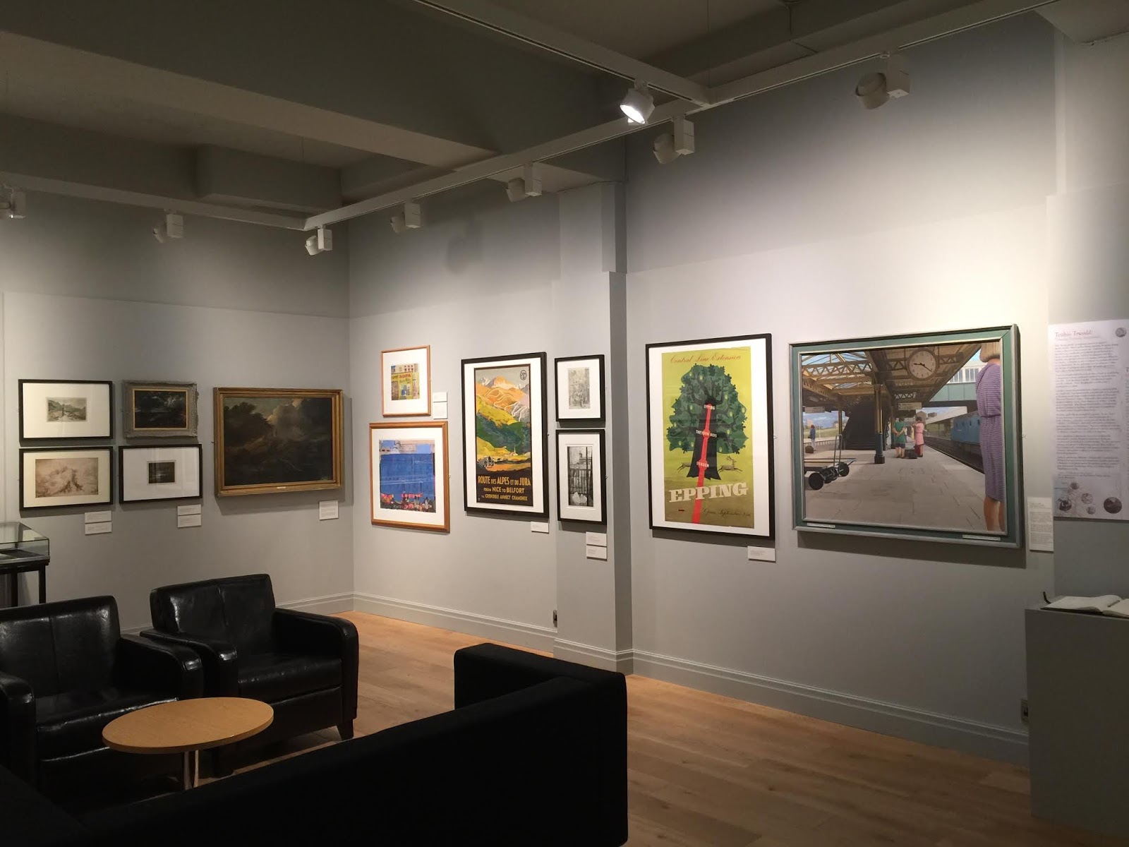
Travelling Through, installation view
As someone who teaches art history, and landscape art in particular, to students whose degree is in art practice, curating also enables me to bridge what they might experience as a gap or disconnect between practice and so-called theory, between their lives as artist and art history at large.
It also gives me a chance to make what I do and who I am feel more connected.
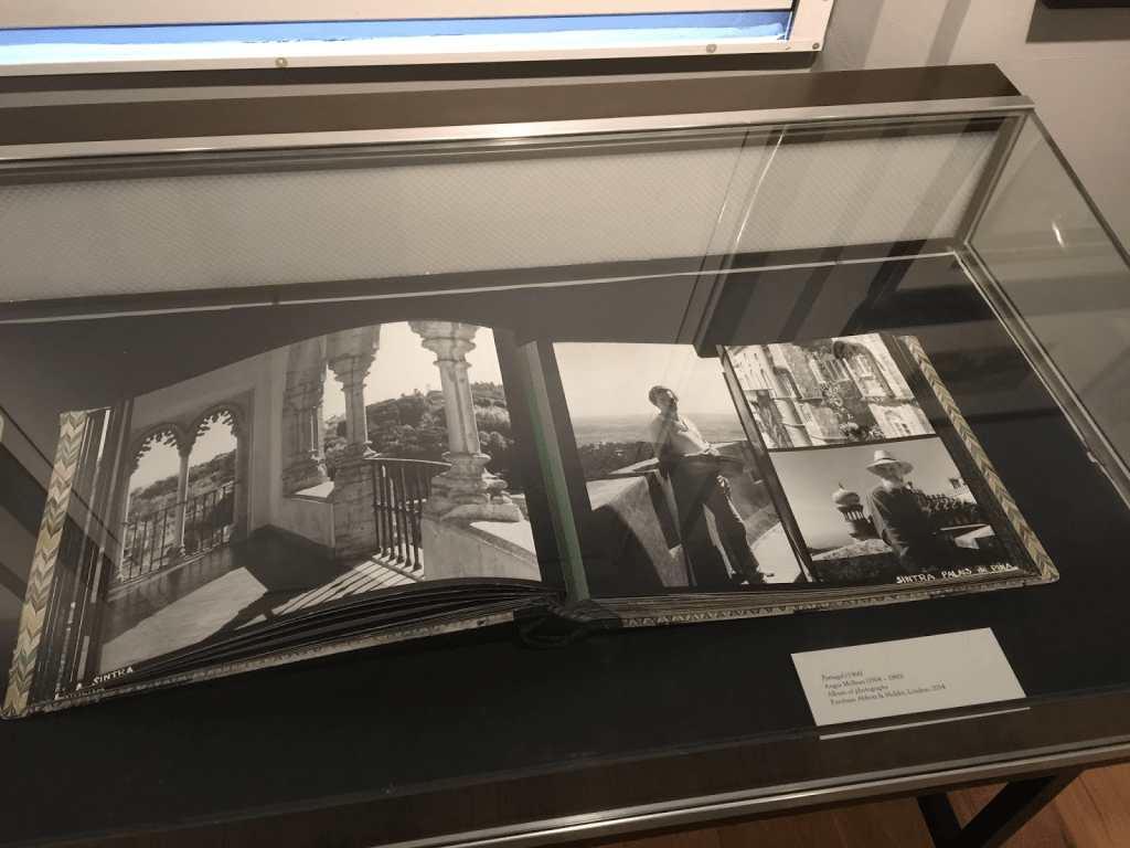
Angus McBean’s personal album of travel photographs featuring McBean and his gay companions (1966)
In my latest interactive and evolving exhibition, Travelling Through: Landscapes/Landmarks/Legacies (on show at the School of Art, Aberystwyth University, Wales until 8 February 2019), I bring together landscape paintings, ceramics, fine art prints, travel posters and luggage labels, which are displayed alongside personal photographs, both by a famous photographer (Angus McBean) and by myself.
Here is how I tried to describe the display of those never before publicly displayed images from my personal photo albums:
Before the age of digital photography, smart phones and social media, snapshots were generally reserved for special occasions. Travelling was such an occasion.
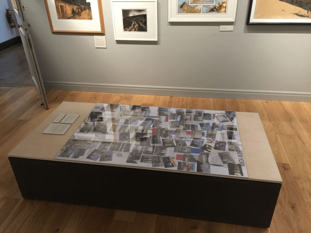
For this collage, I rummaged through old photo albums and recent digital photographs. When I lived in New York, from 1990 to 2004, I very rarely photographed the city. All of these images either predate that period or were produced after it. The historic event of 11 September 2001 can be inferred from the presence and absence of a single landmark.
The World Trade Center is prominent in many of my early tourist pictures. Now, aware of my gradual estrangement from Manhattan, I tend to capture the vanishing of places I knew.
Plinth display of NYC, Travelling Through Me (1985 – 2018), digital and digitised photographs
For this collage, I rummaged through old photo albums and recent digital photographs. When I lived in New York, from 1990 to 2004, I very rarely photographed the city. All of these images either predate that period or were produced after it. The historic event of 11 September 2001 can be inferred from the presence and absence of a single landmark.
The World Trade Center is prominent in many of my early tourist pictures. Now, aware of my gradual estrangement from Manhattan, I tend to capture the vanishing of places I knew.
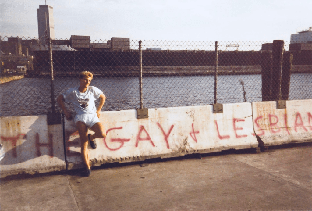
Lost New York City landmarks: Twin Towers and Gay Pier, 1987
Back in the 1980s, New York was not the glamorous metropolis I expected to find as a tourist. My early photographs reflect this experience. Most are generic views of the cityscape. Others show that I tentatively developed an alternative vision I now call ‘gothic.’ Yet unlike Rigby Graham, whose responses to landscape are displayed elsewhere in this gallery, I could never quite resist the sights so obviously signposted as attractions.
Like the personal photo album of the queer Welsh-born photographer Angus McBean, also on show in this exhibition, these pages were not produced with public display in mind. McBean’s album was made at a time when homosexuality was criminalised. It is a private record of his identity as a gay man.
I came out during my first visit to New York. The comparative freedom I enjoyed and the liberation I experienced were curtailed by anxiety at the height of the AIDS crisis.
Being away from home can be an opportunity to explore our true selves. Travelling back with that knowledge can be long and challenging journey.
Harry Heuser, exhibition curator
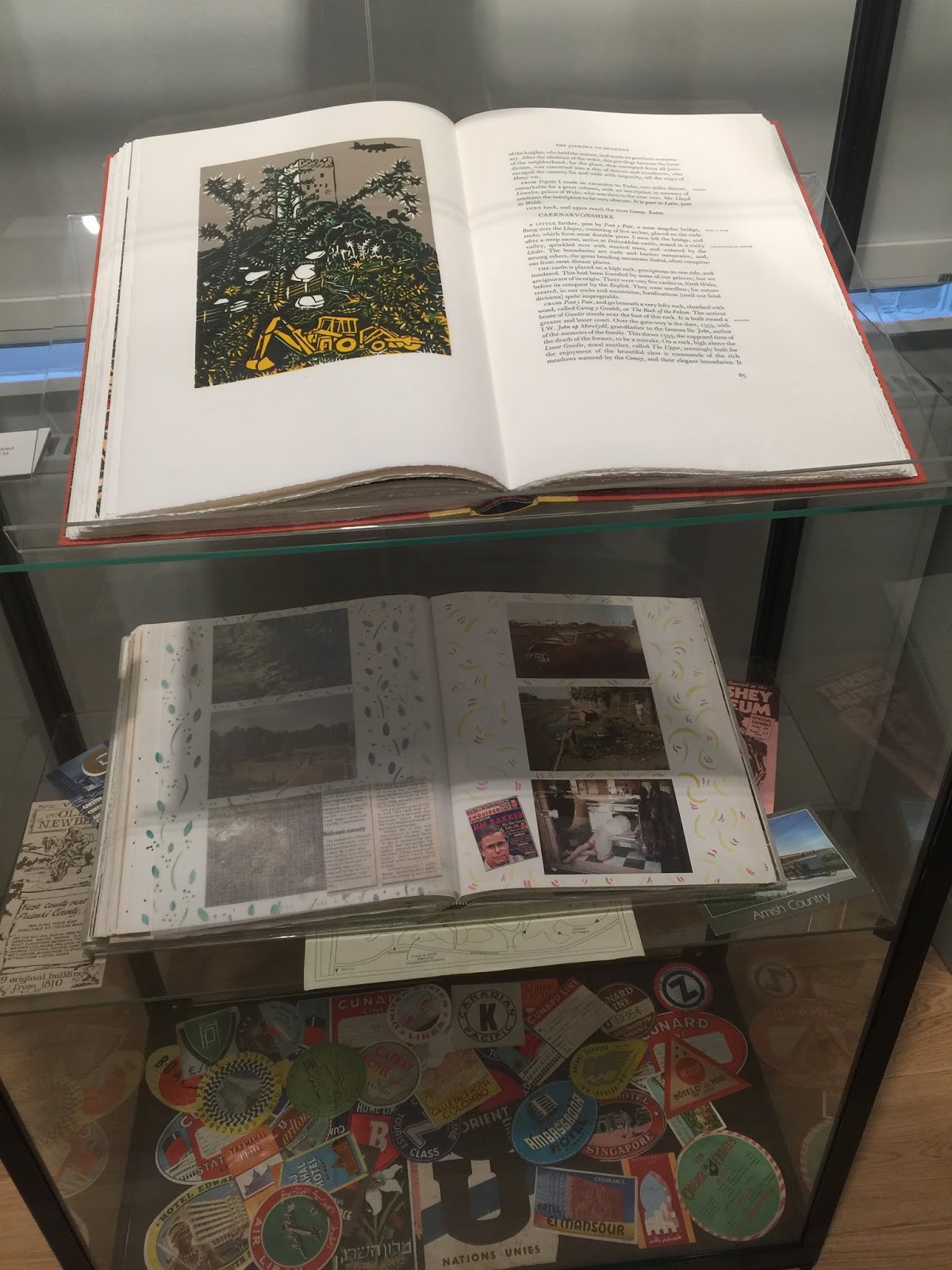
Pennant Tour of Wales featuring illustrations by Rigby Graham, with one of my photo albums and a collage of luggage labels from my collection beneath it.
Poster by Neil Holland, based on a design by Lauren Evans
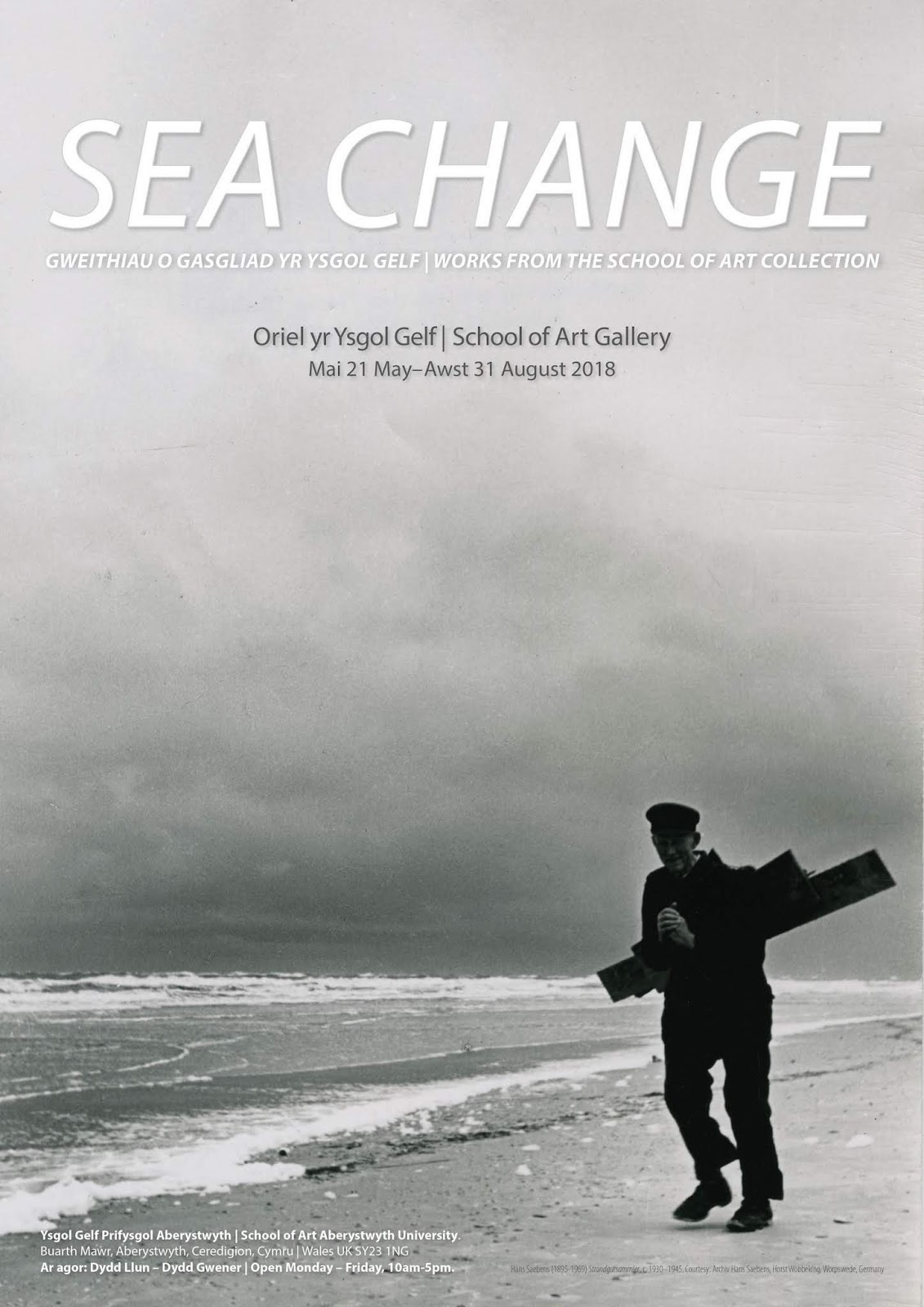
Once a year, I stage an exhibition with undergraduate students of my module “Curating an Exhibition” at the School of Art, Aberystwyth University. The student curators choose objects from the School’s collection, which, over a period of about three months, they research, interpret and narratively arrange in relation to a given theme. The theme for the 2018 exhibition (on show from 21 May until 28 September) is “Sea Change.”
The idea for it came to me watching CNN, where the phrase is frequently heard in promotional spots for Fareed Zakaria’s program. What, I thought, would happen if we considered the literal meanings of each part of the phrase to examine how life along the coast is transformed and transforming as a result of environmental and socio-political developments.
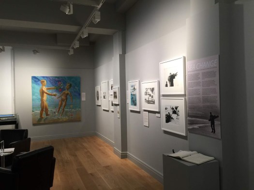
Installation view showing John Roberts’s large painting Fond Farewell (1973)
As always, the narrative evolved gradually, shaped by the objects selected by the exhibition curators. This is the text panel introducing the exhibition:
‘Sea change’ is one of the many expressions introduced to the English language by Shakespeare. It appears in The Tempest as a reference to death – and transformation – by drowning.
This exhibition of works from the School of Art collection explores both the metaphorical and the literal meanings of the phrase.
Today, ‘sea change’ is widely used to suggest moments of upheaval and reorientation. It may denote the end of a personal relationship or a geopolitical shift affecting the lives of millions. Whatever its measurable repercussions, ‘sea change’ is always felt to be profound.
Change may be dreaded or desired. It can mean at once breakdown and a chance for renewal. The storm that wrecks a ship and lays waste to dreams brings firewood to the beachcomber. The engines that turned villages into mill towns also transported workers to holidays by the sea.
Plate, from the series Cumbrian Blue(s) (1998) by Paul Scott
Many aspects of modern society were shaped in the Victorian era. Seaside towns like Aberystwyth owed their transformation to the Industrial Revolution. Since then, our coastal communities have continued to adapt. New challenges, from Global Warming to Brexit, lie ahead as Wales is celebrating the ‘Year of the Sea.’
The prints, paintings, photographs and ceramics on display encourage us to consider what we gain or lose through stability and change.
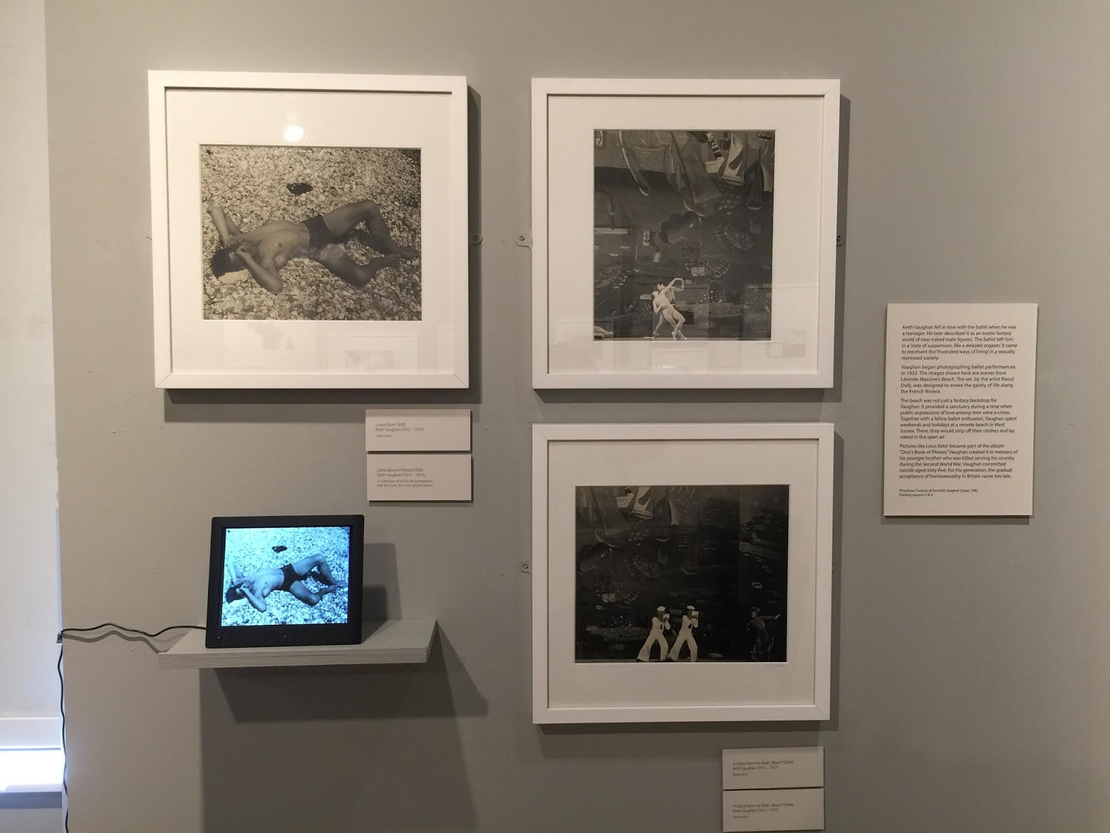
Works by Keith Vaughan feature prominently in the exhibition
Artists whose works are featured in this exhibition include Jean-Antoine Théodore Gudin (1802–1880), Honoré Daumier (1808–1879), Wilhelm Kümpel (1822–1880), Hans Saebens (1895 – 1969), Carlo Bevilacqua (1900 – 1988), Gertrude Hermes (1901–1983), Keith Vaughan (1912 – 1977), Robert Tavener (1920–2004), Gwyn Martin (1921 – 2001), John Vivian Roberts (1923–2003), Bernard Cheese (1925–2013), Terry Bell-Hughes (b. 1939), Chris Penn (1943–2014), Alistair Crawford (b. 1945), Paul Scott (b. 1953), and Kate Malone (b. 1959).
Curators: Lauren Evans, Gerry McGandy, Mike Kirton, Clodagh Metcalfe, Sophie Mockett, Ivy Napp, John Roberts, and Michelle Seifert; with support from Harry Heuser (text and concept) and Neil Holland (staging and design). Additional assistance by Karen Westendorf
I am grateful for second chances. Following on from the 2017 Royal Academy exhibition “Second Nature,” which Robert Meyrick and I prepared in conjunction with the publication of our catalogue raisonné of Charles Tunnicliffe’s prints, I created a new show exploring the painter-printmaker’s career. “‘To hell with nature!’: A Reappraisal of Charles Tunnicliffe Prints” is on display at the School of Art Museum and Galleries, Aberystwyth University, in Wales, until 12 March 2018.
Poster design by Neil Holland, showing a detail of Tunnicliffe’s The Stuck Pig (1925)
The new show has been curated to highlight four phases of Tunnicliffe’s printmaking career: his student days, in which work on the family farm became the subject of his autobiographical prints; his success as a maker of fine art prints; his second career as an illustrator and commercial artist after the collapse of the print market in the early 1930s; and his ‘decorative’ works featuring birds to whose study he devoted much time after he moved to Anglesey in North Wales.
Charles Tunnicliffe (1901–1979) grew up and worked on a farm near Macclesfield in Cheshire. A scholarship enabled him to study at the Royal College of Art in London. Soon after his studies, he gained a reputation and a market in Britain and the United States as an etcher of farming subjects.
In 1929, Tunnicliffe married a fellow art student, Winifred Wonnacott. The couple settled in Macclesfield. Although Tunnicliffe enjoyed the theatre and the movies, as his diaries tell us, London never featured in his fine art prints. In middle age, not long after the end of the Second World War, Charles and Winifred Tunnicliffe relocated to Anglesey, where Tunnicliffe became an avid birdwatcher. Today, Tunnicliffe is closely associated with his study of birds and is widely regarded as Britain’s foremost twentieth-century wildlife artist.
Towards the end of a career spanning six decades, Tunnicliffe was awarded the Gold Medal of the Royal Society for the Protection of Birds. It may seem somewhat incongruous that, in an interview published in the Society’s magazine, Tunnicliffe stated:
‘I have shocked quite a lot of people by saying ‘To hell with nature!’ Nature is made to be used, not to be dictator, as far as the dyed-in-the-wool artist is concerned.’
I used this exclamation as the starting point for my exploration of Tunnicliffe’s career. To me, it expresses the frustration of an artist whose pictures are often judged on the strength of their fidelity to nature. Instead, Tunnicliffe’s prints show us nature transformed by culture and outdone by art. They demonstrate their maker’s knowledge of art history, his love of design, and the need to tell his own story.
It was printmaking that earned Tunnicliffe his Royal Academy of Arts membership in 1954. By then, however, he rarely produced fine art prints. For decades, Tunnicliffe’s work in various media appeared in magazines, on calendars and biscuit tins.
The stock market crash of 1929 had made it necessary for Tunnicliffe to rethink his career. Turning from etching to wood engraving, he became a prolific illustrator. His first project was Tarka the Otter.
Anglesey was no retreat for Tunnicliffe. Working on commission, he created colourful paintings he described as ‘decorations for modern rooms.’ He also continued to turn out mass-reproduced designs that promoted anything from pesticides to the Midland Bank. The messages these images conveyed were never the artist’s own.
Since the mid-1930s, Tunnicliffe’s work has been appreciated mainly second-hand. Until last year, when Robert Meyrick and I put together a catalogue raisonné of his etchings and wood engravings, Tunnicliffe never had a printmaking exhibition at the Royal Academy.
For some of his early prints, we were unable to trace contemporary impressions. The plates, which Tunnicliffe retained, were proofed by School of Art printmaker Andrew Baldwin.
Exhibitions like ‘To hell with nature!’ remind us what many histories of twentieth-century art omit in order to sustain their focus on the avant-garde. Tunnicliffe’s career does not fit into the narrative of Modernism. It is a product of modernity. In his work, at least, he never said ‘to hell’ with culture. Pragmatic yet passionate, he made images to make a living.
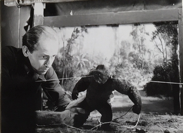
Installation view, Recapturing Mighty Joe Young: The Movie! The Memory!! The Make-believe!!!, School of Art, Aberystwyth University, 20 Nov. 2017 to 2 Feb. 2018
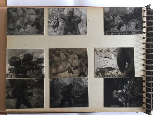
Put on display like a corpse in a glass coffin, the album in the centre of our gallery at Aberystwyth University is a relic of a bygone era of moviemaking. It features documentarian photographs, production stills, concept drawings and watercolour storyboards.
These images showcase ingenuity, commemorate teamwork, and highlight the efforts of the many artists involved in creating make-believe. They are shown alongside each other in the album to demonstrate how ideas were realised.
A page from the album in the Aberystwyth University School of Art collection
Why showcase this album here? Why now? Why bother commemorating the production of a relative commercial failure that, by now, is technically outmoded?
My motivation for staging this exhibition is rooted in a queer identity and a sense of belatedness. Mighty Joe Young – the story of a captured primate exploited for profit and sentenced to death for revolting – affects me with its pathos and its promise of xenophilia triumphant. By accommodating its memorialization in our gallery, I seek to contest notions of cultural relevance and the trivialisation of nostalgic longing as ahistoric sentimentality.
The album defies history by unfolding Joe’s story in fictional time. It captures the film’s production in the sequential order of its narrative, not in the chronological order of its planning and shoot.
Conceived in 1945, filmed over a period of fourteen months, and released in 1949, Mighty Joe Young did not keep up with the times. Its compassion for the outsider and its indictment of consumer culture is an expression of early post-war idealism. Was the right to consume equal to the pursuit of happiness for which GI Joes and Jills had risked their lives? Mighty Joe Young’s climactic orphanage fire suggests otherwise.
‘Mr. Joe Young,’ as the giant yet gentle gorilla is announced in the credits, stands apart from the Atomic Age monsters of the Cold War era in whose destruction we are encouraged to relish. The menace in Mighty Joe Young is not its title character. Mighty Joe poses no threat to the Average Joe. The enduring, transcontinental friendship of Jill and Joe is proposed as an alternative to the fears and desires that tear us apart.
Lego sculpture by Richard Boalch
Perhaps, this is why Mighty Joe Young was not a commercial success. By the time of the film’s release, red-menaced consumers had been conditioned to accept as the new normal what the film fantastically surmounts. The contemporary press called Mighty Joe Young‘incredible corn.’
A banana peel of discarded values, a throwback like Mighty Joe Young– and an album devoted to its making – can make us mindful of lost chances, and of the biases and restraints operative to this day.
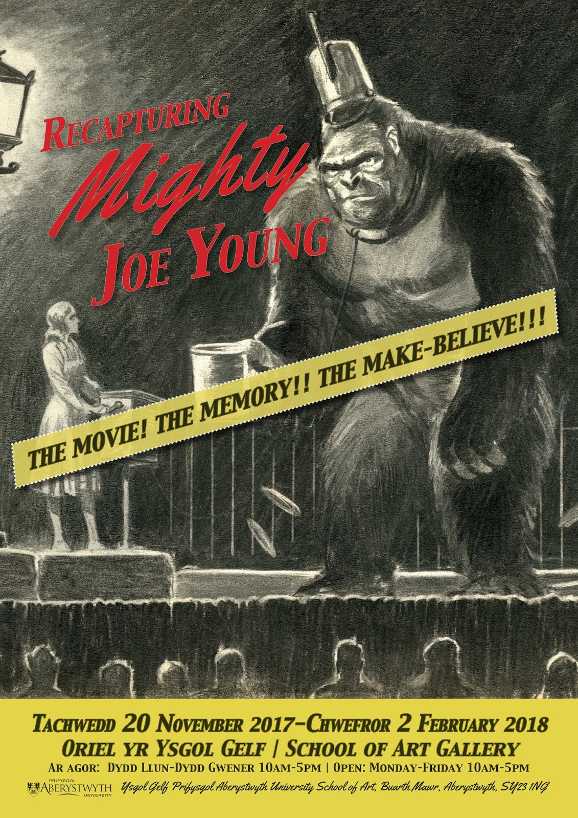
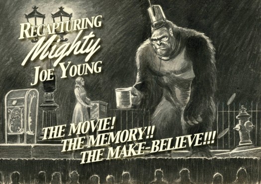
Poster design by Neil Holland using a 1940s concept drawing for Mighty Joe Young
As announced in my previous post, I am staging the exhibition Recapturing ‘Mighty Joe Young’ at the School of Art, Aberystwyth University (see poster for details).
This is my introductory text panel for the show:
From adaptations of Edgar Allan Poe’s “Murders in the Rue Morgue” (1841) to the latest installment in the Planet of the Apes saga, non-human primates have played a prominent part in the evolution of motion pictures. Ridiculous and sublime, they act as uncanny doubles of our uncouth selves.
Until well into the 1980s, silver screen simians were often aped by actors in hairy suits. A memorable exception is the original Kong, the uncrowned King of Skull Island. Mighty Joe Young (1949) is one of his descendants.
Joe was brought to life by the creative team responsible for King Kong (1933) and its sequel, Son of Kong (1933). The large volume displayed in the centre of the gallery is Joe’s baby album.
The album commemorates the collaborative efforts that earned Mighty Joe Young an Academy Award for Special Effects. Showing off the tools and tricks of the trade, it contains documentarian photographs as well as drawings and watercolour paintings by Willis ‘Obie’ O’Brien, the film’s ‘Technical Creator.’ The album also records the work of Obie’s apprentice, Ray Harryhausen, whose name became synonymous with pre-CGI fantasy film and stop-motion animation.
The album is on public display for the first time. It was compiled retrospectively, probably by a member of the crew. Along with hundreds of books and journals, it was bequeathed to Aberystwyth University by the film historian Raymond Durgnat (1932–2002), to whose legacy this exhibition pays tribute.
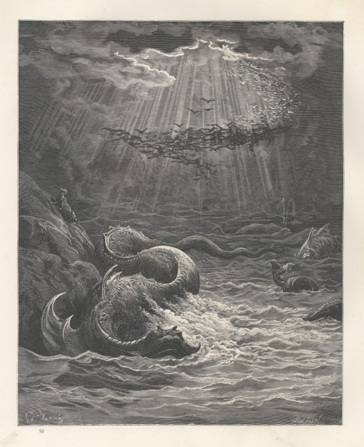
Surrounding the album are posters, promotional materials as well as 1940s concept drawings for animated movies produced by Walt Disney and Fleischer Studios. Also on show are prints by Gustave Doré and John Martin. Their fantastic and awe-inspiring images were precursors of cinematic spectacles. Both O’Brien and Harryhausen referenced them in their work.
As a curator, educator and writer, I aim to promote interconnections between the arts as well as the creative industries and academic disciplines devoted to them. Instead of imposing a context in which our album might be contained, I let it take over the gallery to disclose its stories and open new associations.
The public is invited to shape this evolving display by sharing responses to Joe in animation workshops scheduled during the show’s run. Like the homage in Lego you encounter in our gallery, the videos created in those workshops will become part of this exhibition.
Preliminary poster design by Neil Holland using a 1940s concept drawing for Mighty Joe Young
This fall, I am curating an exhibition featuring a unique album commemorating the production of the 1949 Hollywood fantasy movie Mighty Joe Young. The brainchild of the creative team responsible for King Kong (1933), Mighty Joe Young earned an Academy Award for Special Effects.
The album contains over 100 stills from the film as well as documentarian photographs, drawings and watercolour paintings. It provides insights into the production of Hollywood movies, and in pre-CGI visual effects and the work of the celebrated stop motion animator Ray Harryhausen (1920–2013) in particular.
The album has never been on public display before, and little is known about its origins or provenance. Along with hundreds of books and journals, it was bequeathed to Aberystwyth University by the film historian Raymond Durgnat (1939–2002).
Ray Harryhausen and Mighty Joe Young
As a curator, I am keen to recover and display objects of visual culture that encourage us to explore connections between the arts as well as the creative industries and academic disciplines devoted to them. The Mighty Joe Young album tells stories of ingenuity and collaboration, of artistic influences and commercial enterprise. The film, meanwhile, is a story of friendship, a friendship that triumphs over greed and the exploitation of innocence.
Gustave Doré, Leviathan for an 1866 edition of Milton’s Paradise Lost
The work of Ray Harryhausen has long attracted enthusiasts of fantasy and science fiction. Now, there is renewed interest in his artistry. Leading up to the centenary of Harryhausen’s birth, major institutions, including Tate Britain in London, have been staging exhibitions of his drawings and sculptures.
Our album has attracted the attention of the Ray and Diana Harryhausen Foundation, who will be giving a presentation in the School of Art galleries on 22 November. We will also hold animation workshops during the run of the exhibition, and the videos created as part of those workshops will be shown in our galleries.
The album will be displayed alongside film posters and promotional materials, as well as production drawings for animated movies of the 1940s. Also on show are prints by Gustave Doré whose sublime and fantastic imagery was a precursor to Hollywood magic and served as an inspiration to Harryhausen. Recapturing ‘Mighty Joe Young’: The Movie! The Memory!! The Make-Believe!!! is on display at the School of Art from 20 November 2017 to 2 February 2018.
I thought that I’d say a few words about the work of the man that brings us together here today – and perhaps about this place in relation to that man.
If Tunnicliffe could be with us today, chances are he wouldn’t be with us. London. The Academy. The artworld. That, he felt, was not his habitat. And yet, we wouldn’t be here if Tunnicliffe had not been elected a member of the Academy – as a printmaker, no less.
Tunnicliffe’s own accounts of his life emphasise his youth growing up and working on a farm. And much of that is reflected in his subject matter.
The Lederhosen were a bit of a gimmick, or a ruse.
Tunnicliffe certainly preferred the outdoors to the inside of institutions. He would rather study bulls than listen to what he would have considered to be so much academic BS. And even though he taught art, Tunnicliffe also said he much preferred birds to boys.
All of this fits the romantic view many of us have of the artist as an outsider. Perhaps, it fits rather too neatly. After all, the farm where Tunnicliffe grew up was near Macclesfield – and the signs of the Industrial Revolution were written in the wind.
Tunnicliffe was not removed from the world of industry or commerce. Nor was he resistant to change. Tunnicliffe, who studied at the Royal College of Art in London, owes his career not to any one institution but to his willingness to adapt.
For decades, far from the madmen crowd, Tunnicliffe produced images that served the advertising racket. His pictures promoted farming products (some toxic), spurious wonder drugs (for dogs) and the Midland Bank. Not exactly the messages of a lover of nature.
The thing is, Tunnicliffe’s pictures were not designed as vehicles for his own thoughts. He made products of visual culture to which messages could be attached by others, at a price, to suit their purposes.
Tunnicliffe also produced book illustrations. Many of his wood engravings – and the many more scraperboard images we are not even showing here – were secondary to a given text, enhancing or supporting it.
By the time he became an Associate of the Royal Academy, in 1944 (and a full member ten years later), Tunnicliffe had ceased to produce so-called ‘fine’ prints. The stock market crash had made it necessary for Tunnicliffe to rethink his career and to find his niche in order to make a living as a maker of images.
Partly as a result of this commodification, Tunnicliffe’s prints were never exhibited in a solo show here at the Royal Academy – until now.
You might well protest that what you see on display here today is not much of a print exhibition, either, given that his wood engravings are displayed alongside cheap reproductions and colourful paintings that might overpower them.
Print curator James Laver said nearly seventy years ago that it was ‘a pity’ that so few visitors to the Royal Academy come to ‘the little room in which the etchings and engravings are exhibited.’ Even those who did come visit had ‘neither the patience nor the strength to appreciate what is on the walls. For prints are intimate things. [They] need individual attention, like shy, sensitive children.’
I hardly think that individual attention span has increased over the last seventy years. And the Royal Academy seems to reflect that, or perhaps give in to it.
What Second Naturedoes bring across is the compromise that is Tunnicliffe’s work, and the way in which editioned prints and one-of-a-kind paintings compete with multiple copies: images of visual culture in the service of commerce, of advertising and the printed word. The purity or sanctity of art is, after all, little more than the modernist rubbishing of modernity.
As I said, this is Tunnicliffe’s first show here as a printmaker. Tunnicliffe regularly exhibited his watercolour paintings here at the Academy’s Summer Exhibitions, and they always sold. The one solo show he had here was an exhibition of post mortem studies of birds from his personal sketchbook back in the early 1970s.
That show was initiated by the Welsh painter Kyffin Williams, who, like Tunnicliffe and his wife, lived on Anglesey.
Well, the Royal Academy did not know quite what to do with those sketches. It consulted an ornithologist who vouched for their accuracy but also said that he had seen many like them just as accomplished. The works were arranged according to family, genus and species. In other words, those private studies, which Tunnicliffe lent only reluctantly, ended up portraying him as an imitator of nature.
Choosing a composition, combining pictorial elements and omitting detail – all that was important to Tunnicliffe. His pictures were designed to be decorative, as he called it. Faithful, decorative, or both at once, Tunnicliffe’s work can easily be coopted by those who say ‘now that is real art.’ Or, ‘when a farmer’s boy can become a Royal Academician, surely there cannot be any talk of inequality.’
Tunnicliffe was pragmatic rather than programmatic. He made images to make a living. But he did not promote a conservative agenda.
The gallery, shortly before the talk
Whether you find such a career uplifting or frustrating is a matter of politics. For me, it is intriguing because it confronts me with my own biases. A career like Tunnicliffe’s does not fit into the avant-garde narratives we resort to when we tell or teach the histories of twentieth-century art from modernism to postmodernism, or roughly the six decades during which Tunnicliffe worked professionally.
When I thought about a suitable title for our essay and the exhibition on display here, I set out by looking at what Tunnicliffe said about his work. I somehow wanted him – and his works – to stand on their own and let them do what most of them were not even intended to do – to speak for themselves or, if that is an impossibility, for Tunnicliffe.
In my research on Tunnicliffe, I came across a dramatic exclamation. ‘To hell with nature.’ Tunnicliffe said that in a nature lover’s magazine devoted to British birds. He said it toward the end of his career. To me, it expresses the frustration of a man whose work is generally judged on the strength of its resemblance to nature. As a kind of second-hand nature.
It would have made for a provocative title, don’t you think? But, even though I would have been quoting him, I would also have taking such a rare public outburst out of the context of a career predicated on compromise.
I wonder what would have happened if Tunnicliffe had dared to say ‘To hell with culture.’ He didn’t. In his work, at least, he did not question the socio-economics that restricted him to serve the market. His earlier work is autobiographical. His family members are worked into his subjects. After the stock market crash, commercial work kept him so busy, there was hardly time for the luxury of self-expression that we perhaps tend to overvalue today.
Tunnicliffe did not make environmental statements. He did not push any agenda. I wish he had. When we look at his work, we should perhaps acknowledge that, whether we perceive this as a lack or not, an apparent neutrality lends itself to being naturalized. A second nature is, after all, culture.
So, is it possible meaningfully to discuss the achievements of printmakers like Tunnicliffe without the politics? I am not sure. But I hope our book – and this exhibition here at the Academy – raises awareness of a printmaker whose work never quite made it into our art histories because it does not fit into the history of twentieth century art, a history that, to suit a grand narrative of progress, we have turned into the history of cultural products that we can lift up or push away as we deem fit.
Our Japanese ‘Merman’ made for a suitable poster boy. Poster design by Neil Holland, based on an idea by Sarah Selzer
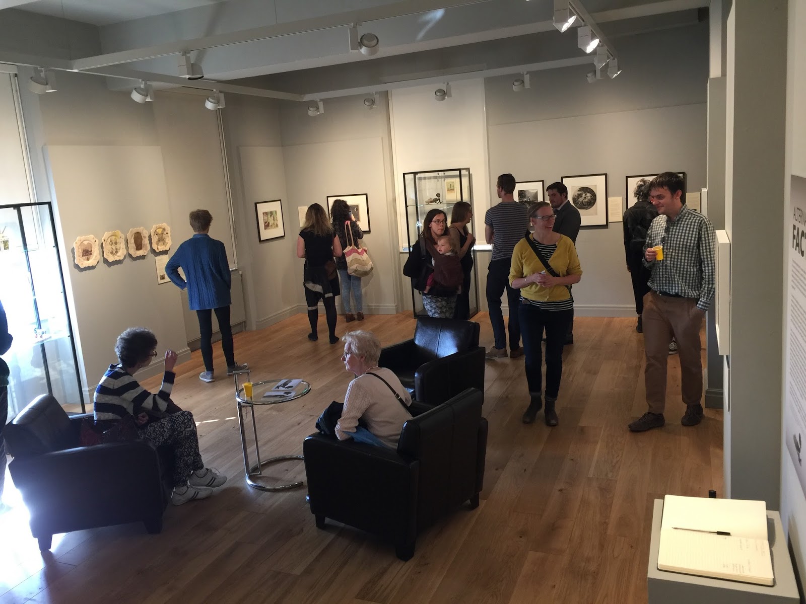
Once a year, with the help of the head curator of the School of Art, Aberystwyth University, I stage an exhibition with a group of students who are enrolled in my undergraduate module “Curating an Exhibition.” The shows draw on the University’s vast collection of art and artefacts. The student curators are given a theme and set out to create a narrative by selecting objects in response to it. That is quite a challenge, considering that the exhibition is put together in just over three months from initial planning to display.
Past exhibitions include Untitled by Unknown, Queer Tastes, andMatter of Life and Death. This year, I was all set to use the colour red and its connotations as a theme . . . until the inauguration of Donald Trump and the ensuing dispute about the size of the audience made me see red in a different way. This gave me the idea for a more urgent, topical show.
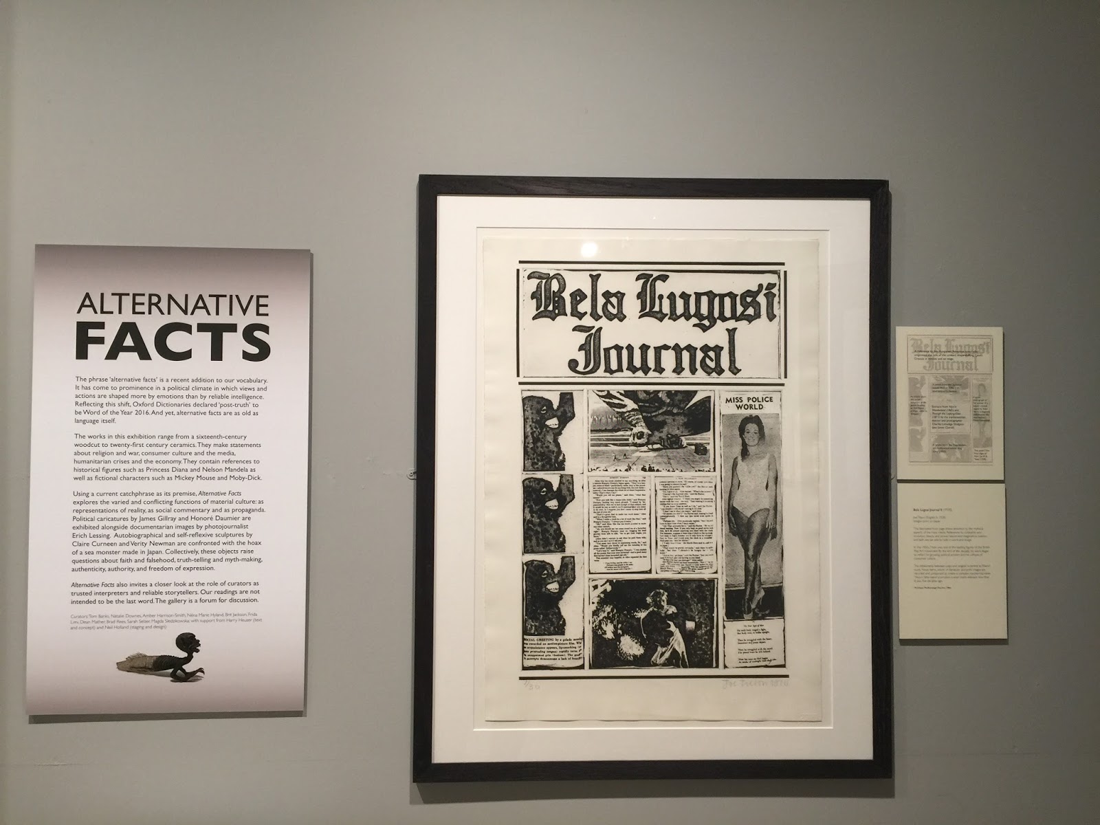
That show is Alternative Facts: Interpreting Works from the School of Art Collection. It opens on 22 May and will be on display until 29 September in one of the School of Art’s galleries in Aberystwyth, Wales.
The introductory panel explains the theme as follows:
The phrase ‘alternative facts’ is a recent addition to our vocabulary. It has come to prominence in a political climate in which views and actions are shaped more by emotions than by reliable intelligence. Reflecting this shift, Oxford Dictionaries declared ‘post-truth’ to be Word of the Year 2016. And yet, alternative facts are as old as language itself.
The works in this exhibition range from a sixteenth-century woodcut to twenty-first century ceramics. They make statements about religion and war, consumer culture and the media, humanitarian crises and the economy. They contain references to historical figures such as Princess Diana and Nelson Mandela as well as fictional characters such as Mickey Mouse and Moby-Dick.
Using a current catchphrase as its premise, Alternative Facts explores the varied and conflicting functions of material culture: as representations of reality, as social commentary and as propaganda. Political caricatures by James Gillray and Honoré Daumier are exhibited alongside documentarian images by photojournalist Erich Lessing. Autobiographical and self-reflexive sculptures by Claire Curneen and Verity Newman are confronted with the hoax of a sea monster made in Japan. Collectively, these objects raise questions about faith and falsehood, truth-telling and myth-making, authenticity, authority, and freedom of expression.
Alternative Factsalso invites a closer look at the role of curators as trusted interpreters and reliable storytellers. Our readings are not intended to be the last word. The gallery is a forum for discussion.
Curators: Tom Banks, Natalie Downes, Amber Harrison-Smith, Néna Marie Hyland, Brit Jackson, Frida Limi, Dean Mather, Brad Rees, Sarah Selzer, Magda Sledzikowska; with support from Harry Heuser (text and concept) and Neil Holland (staging and design)
Today it is easier than ever to produce and share photographs. Subjects diversify. Perspectives broaden. We no longer have to deal with precious materials or finite rolls of film when determining who or what is worth a shot. Yet images are also more readily manipulated. Realities are filtered and faked. The black-and-white photographs in Matter of Life and Death predate our digital age. Fragile and bold, these infinitely multipliable images of singular moments and individual lives were intended to live and matter as prints.
How do we measure the importance of a life? Who or what is worth remembering? These are some of the questions raised by photographs such as the ones on display in Matter of Life and Death, an exhibition on view from 16 May to 9 September 2016 in the gallery of the School of Art at Aberystwyth University in Wales.
Looking at images of people and places can make us aware of our cultural differences. But it is not difficult to find universals in photographs produced worlds apart. Struggling farm workers in 1930s Alabama are shown alongside striking miners in 1980s Sardinia and South Wales. The town of Aberystwyth, where the exhibition is staged, is featured next to Palermo and Bangkok. Visitors to our gallery will see the faces of children. But they will also face the aged, the dying and the dead.
All of the photographs are from the University’s collection. They were chosen by School of Art students who then debated how to exhibit them and create a narrative. Only the medium and the title had been decided beforehand by me, the instructor of Staging an Exhibition, a course in curating that each year culminates in a show like this one. Previous exhibitions include Queer Tastes, Untitled by Unknown, and Face Value.
The selections students made for Matter of Life and Death are journalistic and surrealist, propagandistic and personal, mass marketed and private. Some photographers – Walker Evans, Mario Giacomelli and Angus McBean among them – are famous. Others are unknown. Learning about the identity of a photographer may well influence the way we look at the work that photographer has produced. A child may look less innocent once we know that the man behind the camera was Erich Retzlaff, a photographer who supported and propagated fascist ideals.
All of the photographs are from the University’s collection. They were chosen by School of Art students who then debated how to exhibit them and create a narrative. Only the medium and the title had been decided beforehand by me, the instructor of Staging an Exhibition, a course in curating that each year culminates in a show like this one. Previous exhibitions include Queer Tastes, Untitled by Unknown, and Face Value.
There is no particular order in which these photographs should be experienced. Themes such as dying traditions or endangered environments are suggested, but there are no conclusions. As in life, material circumstances limit our choices. The paths we forge are our own.
Matter of Life and Death is open to the public until 9 September 2016. Admission is free.
Curators: Megan Evans, Rebecca Fletcher, Suzanne Fortey, Emma Game, Emily Griffin, Elizabeth Kay, Kirils Kirijs, Michael Kirton, Maria Lystrup, Kate Osborne, Amy Preece, Georgia Record, Emma Roberts, Samantha Robinson, Emily Smyth, Bethany Williams, Gemma Woolley; with support from Harry Heuser (text) and Neil Holland (design)
A “companionable thing.” That is how the English painter-printmaker Stanley Anderson (1884 – 1966) summed up what “art” should be. His work reflects this sentiment, even though much of it was produced in solitude – slowly and studiously. Staging the exhibition, Unmaking the Modern: The Work of Stanley Anderson, I was glad to have had another chance of giving my contemporaries an opportunity to get acquainted with Anderson, who died on this day fifty years ago, and to have a conversation with him as he, through his work, continues to communicate his beliefs.
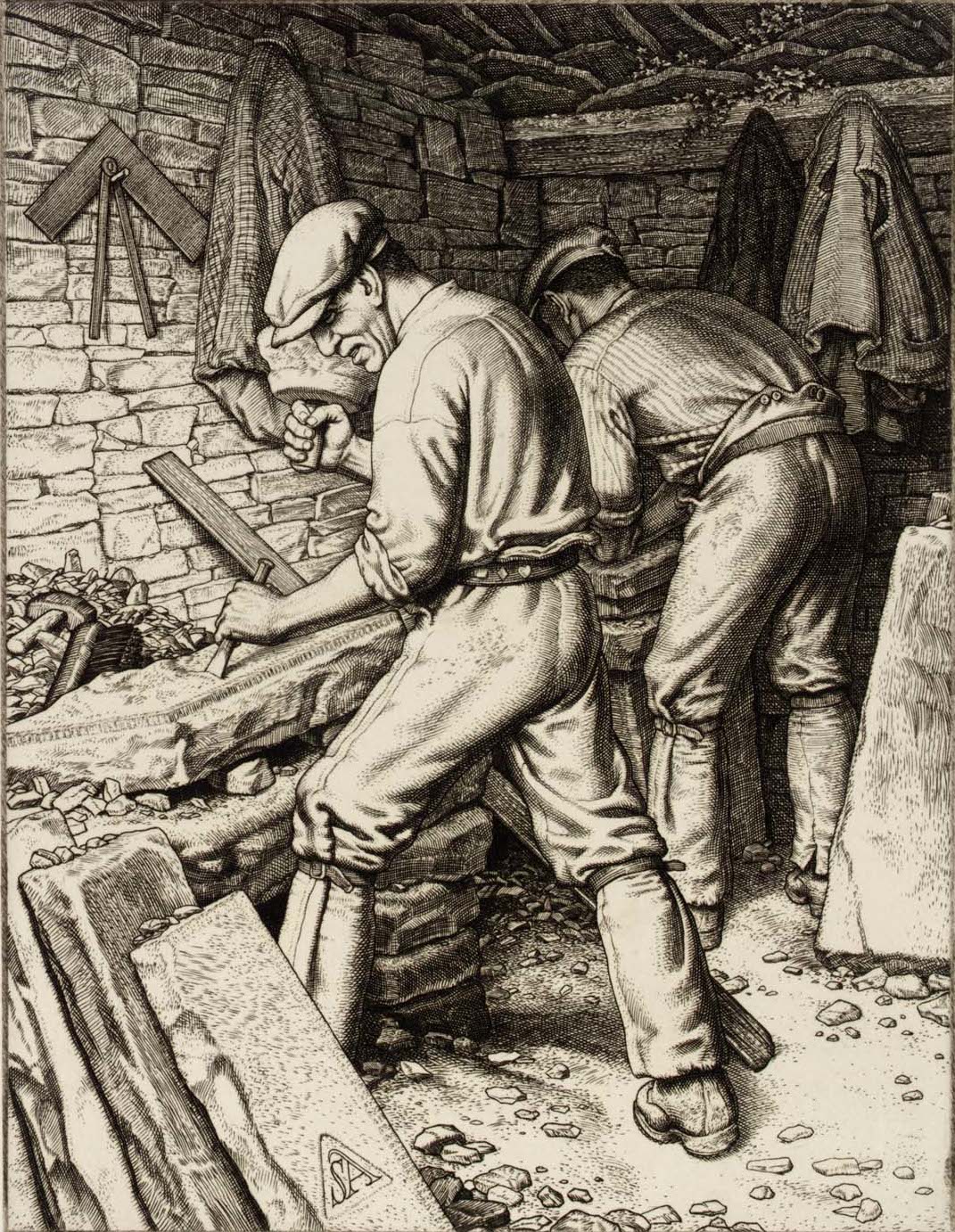
Stanley Anderson, Purbeck Quarrymen (1936), engraving
I say “another chance,” as I had previously co-curated an exhibition of Anderson’s prints at the Royal Academy in 2015 and, getting to know Anderson through his prints and correspondences, written about him with my better half, Robert Meyrick, a book that was released to coincide with that show. Staging this second exhibition, Unmaking the Modern, a year later, I concentrated on Anderson’s efforts to bring about the conversation he hoped for – a conversation about the disregard for a generation of men like him who saw their lifetime commitment to traditions threatened by so-called progress.
Much of what Anderson chose to engage with and bring to our attention has disappeared: traditions gone and skills abandoned, rural communities destroyed and urban neighborhoods demolished, lives lost and often forgotten. This may well evoke a sense of nostalgia. But that nostalgia is ours, not Anderson’s.
Anderson did not refer to himself as an “artist” and rejected the idea that makers of cultural products should create such works for art’s sake or as a means of self-expression. Making art, like doing any other meaningful work, was to him a social act – a “companionable thing.”
Anderson observed those changes as they took place: the demolition of buildings, the erection of shrines to profit and temples devoted to the exchange of money. He responded concretely and in no uncertain terms to what he saw going on in his lifetime. His works are not so much a lament as they are public outcries and displays of solidarity with those who, like him, where threatened by a demand for speed and expediency.
Objects of visual culture, especially prints, are a way of reaching out and fostering connections among individuals who share the values that are made manifest in arts and crafts. Anderson’s works are the products and tokens of fellowship. He took careful note of how others around him carried out their jobs of creating furniture, of working the land, and of serving the community. He understood their labor and honored it with the work of his own hands. Each print bespeaks a communion, a faithful, generous and sustained engagement with his subjects.
Anderson also looked at – and insisted on making us see – the forgotten men of his day: the homeless, the destitute and the aged. He cast a light on individuals that society had turned into outcasts, misfits that could not or would not conform to the dramatic changes that progress demanded.
Installation view of the exhibition at the School of Art Museum & Galleries, Aberystwyth University
Anderson was not opposed to commerce; indeed, market scenes were among his favorite subjects. Born in Bristol, he had trained for seven years as a professional engraver in his father’s workshop. He was already in his mid-twenties when he was awarded a scholarship to study printmaking at the Royal College of Art in London. Art – and the teaching of printmaking – were jobs to him. Being a Royal Academician, meanwhile, was a privilege to him that came with the responsibility of making or promoting art that was not removed from the everyday but that brought people together and that got them looking at each other.
Long before Pop Art, Anderson bridged the divide between high and low culture that modernism had created. He united what modernity insisted on separating: the heart and the hand. This was a conscious decision, as his correspondence bears out, not a lack of awareness of Modernism. After years of studying and using a variety of printmaking techniques, he returned to engraving, which he had long associated with trade.
With those later engravings, he devoted himself to documenting the workaday activities of others – be they craftsmen or farmhands – who, like him, made a living from performing manual work for the benefit of others. Making art, like performing any other meaningful work, was to Anderson a social act – a ‘companionable thing.’
Unmaking the Modern: The Work of Stanley Anderson was on show at the School of Art galleries, Aberystwyth University, Wales, from 1 February to 11 March 2016. An online version is currently under construction.


")

