I am somewhat of a ‘jacket potato,’ as my mother-in-law recently labelled a certain garden-variety of vegetables, soi-disant, that ostensibly thrive in domestic interiors. A book-jacket potato, perhaps; but straitjacket comes to mind as well in these sport-jackets-are-for-hangers days of sitting none-too-pretty.
Not that, in my case, being pomme-de-terrestrial is a recent development. When I was a child, my mother-by-law used to admonish me for being what in my native tongue is called a Stubenhocker: someone not readily dissuaded from following an inclination not to venture beyond the threshold.
I was that all right; but persuading in other than laid hands-on ways was complicated by the fact that I grew up in one of the most unappealing and polluted parts of flat-as-tarmac North Rhine-Westphalia. There’s a pre-industrial reference to that region in the opening paragraph of Candide, which the editors of Norton’s explain thus to the reader: ‘Westphalia is a province of western Germany, near Holland, and the lower Rhineland. Flat, boggy, and drab, it is noted chiefly for its excellent ham.’ Voltaire himself, so the editors note, described the region as ‘vast, sad, sterile, detestable countryside.’ A frank enough assessment to cure any ham of homesickness.
Creating a new virtual home for myself was one of the projects this summer; and my Sitzfleisch (buttocks to you) was sorely tested as I was scanning items from my ephemera collection for online display. Take these luggage labels, for instance, which I exhibited as part of my (Im)memorabilia exhibition back in 2014 and reserved another spot for in Travelling Through in 2018. Their erstwhile collector, whose Latvia-to-London history of wartime displacement is still waiting to be told, probably did not visit most of these places and ‘palaces,’ but the labels may well have been a source of vicarious enjoyment as the trading of Glanzbilder – glossy pictures sold in sheets at the local kiosk for trading among pocket-money possessed youngsters – was for my former self in bleak Westphalia.
But I am in danger of veering off-topic, self-imposed and accommodating as it is. I was speaking travel – a language that’s beginning to sound a lot like Latin. There is so little of it this year that the aforementioned outing to Hay-on-Wye seemed like an exploratory mission to a Shangri-La of normalcy. To think that, in 2019, I started out in Sydney and ended up in Lisbon, with extended visits to my old neighborhood in Manhattan and trips to Amsterdam, London, and Florence in between. It’s the Stubenhocker in me that shall pull me through the pandemic; that, and lexical acrobatics.
I picked up some examples of these former suitcase adornments and searched online for the places they advertise. Are any of them still operating, I wondered? Or might this year have dealt a final blow to yet another pile of real and conceptual bricks in the service of an industry that, for decades, naturalised and solidified our bourgeois divisions of home and abroad, work and leisure, of holiday and everyday?

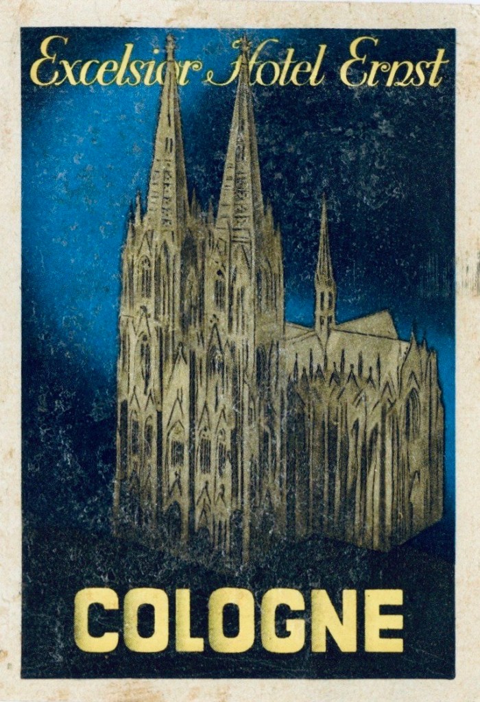
Cologne Cathedral caught my eye – natch – and brought back memories of countless walks past that sooty Gothic spire rising next to the main train station that was my terminal for entering and exiting the ancient city of Köln. It’s a sight that, decades later, became a lingering presence in my Gothic Imagination lectures – the cathedral, I mean, not the station, although, come to think of it, the back then equally sooty and rather more mysteries-filled and fantasy-fueling Hauptbahnhof haunts my teaching as well.
The Excelsior Hotel Ernst was – and is – about as likely a place for me to flop as is the Tomb of the Three Magi that is housed in the cathedral nearby. The only five-star hotel in the old part of the city, it is so close to Dom, in fact, as to warrant its domination of the label design. On its booking website, the establishment claims to have been privately owned since 1863; but the original building, which predates the 1880 completion of the permanent construction site that is the cathedral, was torn down in 1909. Two decades later, the rebuilt hotel was reserved for the British army, which occupied it and much else besides until 1926. Another two decades after that, it was still standing, albeit not without damage, having survived, like the battered Dom, the air raids of the Second World War. And, yes, it weathered the economic fallout of COVID-19, opening again in May 2020 after a brief shutdown. The fragile label, meanwhile, has lost little of its gloss.

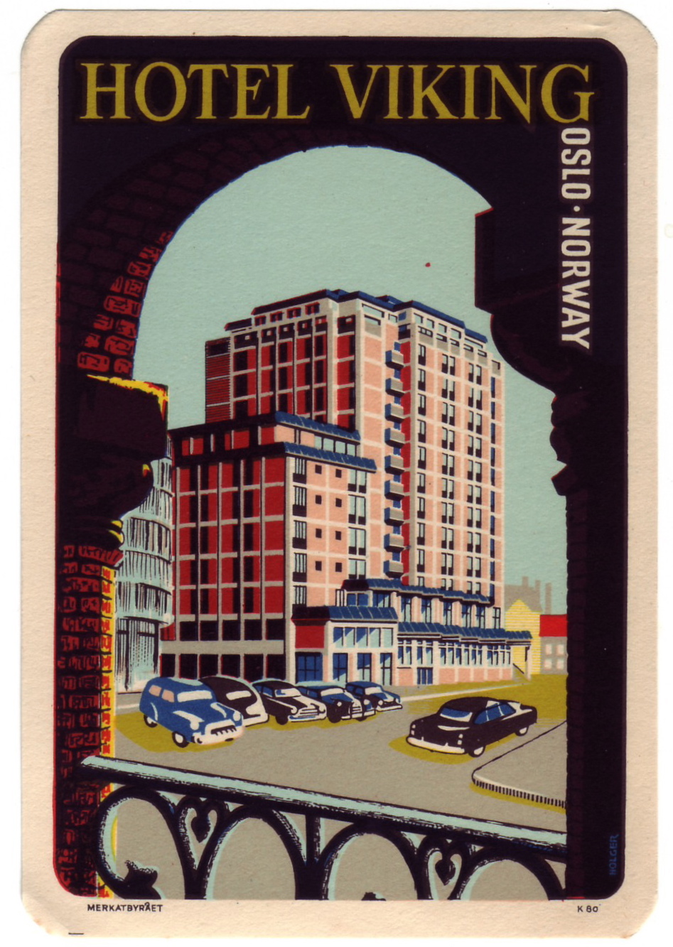
Resisting my cultural conditioning – the notion of vacationing, in my German childhood, being associated with going down south – I picked up the label promoting the Hotel Viking in Oslo. It opened in 1951, an influx of visitors being expected in 1952, the year Oslo hosted the Winter Olympics; it was the first year in which Germany (both East and West) were permitted to participate since Berlin hosted in 1936. Norwegians were not likely to relish the idea of uniformed German delegates and their concomitant supporters invading their capital. The label design frames the new site in a traditional context, suggesting that, even when viewed from more venerable landmarks, it is a sight to behold. The hotel, now called the Royal Christiania – thus declaring itself traditional by referencing the erstwhile name of the city – is still open for business. The label drives home that the hotel was modern by declaring it to be approachable by car; these days, advertisers are less likely to turn the parking space into a feature.

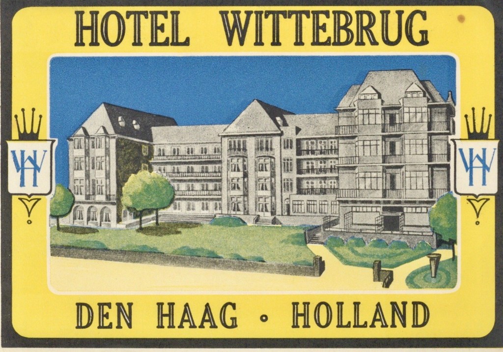
Now, I have never been to Oslo; but on one of my most recent trips to the continent – if ‘recent’ is the word – my husband and I took the train from Amsterdam to spent a few hours in Den Haag, where I had never been until then. I now lecture in landscape art, so seeing paintings of that genre right where they were created in the seventeenth-century Dutch Republic was as thrilling to me as the fantasy of time travel, dismissed as such pictures were by eighteenth-century academics, and many now still under their influence, as prosaic. However, I would have looked in vain for the Hotel Wittebrug, which was torn down in 1972.
The labels are the stuff of daydreams for me at the moment; but they certainly invite further research. Who designed them, and when? How does the design correspond with, or misrepresent, the site depicted? It is a project for someone who, like me, does not believe in the label ‘fine art’ and is not dismissive of products of culture that, like seventeenth-century Dutch landscapes, were commodities sold and bought on the market long before they ended up, removed from our everyday, in pay-to-enter venues set apart for our veneration of them and of the collections that now hold them.
Handling these flimsy pieces of paper now, I am reminded most of all of what I am missing while the world is a world away. Being out of touch does not quite feel as joyous when the sense of touch cannot be exercised occasionally by hugging an old friend or holding onto what seems more echt, or genuine, if it can be had, momentarily, for the holding …
Discover more from Harry Heuser
Subscribe to get the latest posts sent to your email.
